I laid out each piece really loosely without gluing anything down. I haven’t really decided on a unified shape for them, but I wanted to get a better idea of the direction I was going.
For each card I tried to pick out the color(s) most essential to the meaning, and include them somehow in the composition. Most of my sources were in black and white, but I think its important to include color since it goes hand in hand with the meaning of the tarot.
Blue: Spirituality, intuition.
Yellow: Divinity, enlightenment.
Red: Physical world, power.


For the High Priestess, blue is the dominant color so I decided to include it in a halo behind the figure’s head.
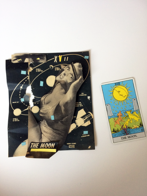

For the moon, blue and yellow are the dominant colors. I scattered blue around the image and placed yellow in the roman numerals, the underline of the title, and in the irises of the eyes on the top of the page.


In the Chariot, yellow is the dominant color with red as an accent. I think this is the weakest of the three- I really want to make it more symmetrical.
